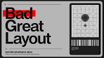
The Art of Layouts in Graphic Design
Layout is a fundamental aspect of graphic design that plays a crucial role in conveying information effectively and engaging audiences. A well-thought-out layout can enhance the visual appeal of a design, improve readability, and create a harmonious composition that guides the viewer’s eye through the content.
Key Elements of Layout
When creating a layout, designers consider various elements such as:
- Grids: Grid systems provide structure and consistency to a layout, helping to align elements and create visual harmony.
- Whitespace: Also known as negative space, whitespace helps to balance the elements on a page and improve readability.
- Typography: The choice of fonts, sizes, and spacing can greatly impact how information is presented and perceived by the audience.
- Images: The placement and size of images within a layout can evoke emotions, convey messages, and enhance the overall design aesthetic.
- Colour: Colour schemes play a vital role in setting the mood and tone of a design, as well as highlighting important information.
The Importance of Effective Layouts
A well-designed layout can make content more accessible and engaging for viewers. It helps to organise information in a logical manner, making it easier for audiences to navigate through complex data or narratives. Whether it’s a website, magazine spread, poster, or brochure, the layout sets the foundation for an impactful design that captures attention and communicates effectively.
Tips for Creating Compelling Layouts
- Plan Ahead: Define your objectives and audience before starting the design process to ensure your layout meets its intended purpose.
- Use Consistent Elements: Maintain visual consistency throughout your layout by using common styles, colours, and typography choices.
- Experiment with Alignment: Explore different alignment options such as centered, justified, or asymmetrical layouts to create visual interest.
- Simplify Complex Information: Break down complex content into digestible chunks using headings, subheadings, bullet points, and other formatting techniques.
- Solicit Feedback: Seek input from peers or clients to gain valuable insights on how your layout can be improved for better impact.
In conclusion, mastering the art of layouts is essential for every graphic designer looking to create compelling visuals that resonate with their target audience. By understanding the key principles of layout design and implementing best practices in your projects, you can elevate your designs to new heights and leave a lasting impression on viewers.
7 Essential Tips for Crafting an Effective Layout Design
- Use a grid system to create a structured layout
- Prioritize readability by choosing appropriate fonts and font sizes
- Maintain visual balance by distributing elements evenly throughout the design
- Consider the hierarchy of information to guide the viewer’s attention
- Utilize white space effectively to prevent overcrowding and enhance clarity
- Ensure consistency in design elements such as colours, styles, and spacing
- Test your layout on different devices and screen sizes for responsiveness
Use a grid system to create a structured layout
Utilising a grid system is a highly effective strategy in graphic design to establish a structured layout that enhances visual coherence and organisation. By aligning elements to a grid, designers can achieve consistency in spacing, alignment, and overall composition, resulting in a clean and professional look. Grid systems not only provide a framework for arranging content but also help guide the viewer’s eye smoothly across the design, improving readability and visual hierarchy. Embracing a grid system empowers designers to create layouts that are visually appealing, balanced, and harmonious, ultimately elevating the overall impact of their designs.
Prioritize readability by choosing appropriate fonts and font sizes
When crafting layouts, it is crucial to prioritise readability by selecting suitable fonts and font sizes. The choice of typography plays a significant role in how information is perceived and absorbed by the audience. Opting for fonts that are clear, legible, and appropriate for the content can enhance comprehension and engagement. Likewise, adjusting font sizes to ensure optimal readability across different devices and mediums is essential for creating a user-friendly experience. By carefully considering typography choices, designers can improve the overall effectiveness of their layouts and effectively communicate their message to viewers.
Maintain visual balance by distributing elements evenly throughout the design
Maintaining visual balance in a design is paramount to creating a harmonious and engaging layout. By distributing elements evenly throughout the composition, designers can achieve a sense of equilibrium that guides the viewer’s eye seamlessly across the design. This balance ensures that no single element overwhelms the others, allowing each component to contribute cohesively to the overall aesthetic appeal. Whether it’s through strategic placement, sizing variations, or colour distribution, achieving visual balance helps create a visually pleasing and effective layout that captures attention and communicates effectively.
Consider the hierarchy of information to guide the viewer’s attention
When designing layouts, it is crucial to consider the hierarchy of information to effectively guide the viewer’s attention. By establishing a clear hierarchy, designers can prioritise key elements, such as headlines, subheadings, and call-to-action buttons, to ensure that important information stands out and is easily accessible to the audience. This strategic approach not only helps viewers navigate through the content seamlessly but also enhances the overall visual impact of the design by creating a structured and engaging experience.
Utilize white space effectively to prevent overcrowding and enhance clarity
Utilising white space effectively in a layout is a key tip to prevent overcrowding and enhance clarity. White space, also known as negative space, provides breathing room for design elements, allowing them to stand out and be easily digestible for the viewer. By strategically incorporating white space around text, images, and other visual elements, designers can create a sense of balance and focus that guides the viewer’s attention precisely where it needs to be. This practice not only improves readability but also adds a touch of elegance and sophistication to the overall design composition.
Ensure consistency in design elements such as colours, styles, and spacing
Ensuring consistency in design elements such as colours, styles, and spacing is a crucial tip in creating effective layouts. By maintaining a cohesive visual identity throughout a design, designers can establish a sense of harmony and professionalism that enhances the overall aesthetic appeal. Consistent use of colours helps to reinforce brand recognition and evoke specific emotions, while uniform styles and spacing contribute to readability and visual flow. This attention to detail not only improves the user experience but also reinforces the credibility and impact of the design as a whole.
Test your layout on different devices and screen sizes for responsiveness
Ensuring the responsiveness of your layout across various devices and screen sizes is crucial in today’s digital landscape. By testing your design on different platforms such as desktops, laptops, tablets, and smartphones, you can guarantee that your layout adapts seamlessly to different screen resolutions and orientations. This practice not only enhances user experience but also demonstrates your commitment to delivering a consistent and accessible design that caters to a diverse audience.